Alchemy’s Branding History
 The early branding of Alchemy jewellery was different to today’s markings. The company’s origins were, as is the case with many nascent companies, not straightforward and its identity evolved over time.
The very first products which launched the venture, around 1976, were a small collection of punk ‘anti-jewellery’, irreverent pins and pendants such as a toilet seat, a graffitied padlock and a bent screw, all made one at a time, hand cast from scrap lead and designed to shock! These were branded as ‘Poker’, with the name hand carved into the back of each model. Then, in 1977, we rented a small shop with a little room for a workshop behind. We named the shop Rieder’s Axe and the company, Rieder Design, after one of our heroes; a revered late 15th century Austrian armourer Kaspar Rieder, from Muhlau, Innsbruck who was a master metalsmith in magnificent gothic style, by appointment to Emperor Maximilian I.
So, after a year or two of persevering we progressed to making more refined designs such as detailed skulls, elaborate axes and crosses, etc, in a much higher quality pewter metal, and it was at this stage that we used for the first time our ‘hallmark’ of ‘RD’. These pieces, although crude by our present standards and made only in very small quantities, were, (little known to us at the time), to be the genesis of Alchemy.
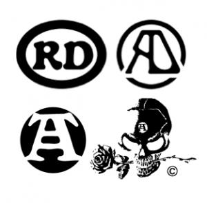
The first ’RD’ hallmark used was made from a regular font within an oval frame, but this was later superseded by a finer, circular brand made with a purpose designed font.
‘RD’ hallmark stamps, Mk’s 1 & 2:
The purpose designed, Uncial inspired font and company logo from which the stamp derived:
![]()
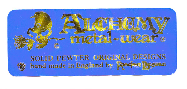
Alchemy Metal-Wear’s first packaging label in gold foil on blue, displaying the Mk.II ‘RD’ mark:
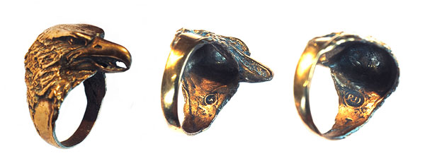
An R3.b, bronze Eagle ring by Alchemy, 1984 version originally sculpted by Trev Phillipson around 1980, showing both the first, tiny ‘A’ stamp and the Mk.1 ‘RD’ stamp:
A P24.g (gilt plated), Druid’s Arrow pendant, circa 1986, showing the early, (and not too distinct), ‘A’ stamp:
![]()
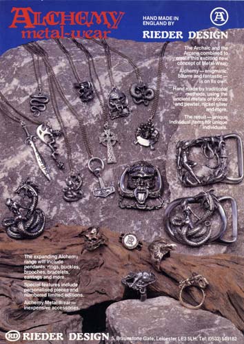
Soon afterwards, we began adding pieces to the product range inspired by some of our rock heroes and even made pins and pendants for some small bands of the time. Sales increased – punks, metal-heads, bikers, D&D gamers, the post-punk and the Renaissance scenes, etc, and by the year 1984, (of Orwellian irony), we decided to produce a brochure of our little collection. For this we needed a product name… we thought very hard and increasingly gravitated towards the word for the mystical, Medieval process of turning lead into gold – Alchemy! Perfect! And as it was rock inspired, and made to wear, we completed the title with ‘Alchemy Metal-Wear’, which became the first incarnation of the Alchemy brand.
The ‘RD’ branding is evidenced by our very first, single page brochure in 1984, as in the hallmark in the bottom left corner, later often accompanied by a small new ‘A’ stamp – top right and adjacent:

Almost immediately, the emerging goth rock scene enthusiastically adopted our products which were still virtually unique at the time, and consequently, along with our own sentiments, more of the newer Alchemy designs were developed with a Transylvanian orientation. Then we soon found that we had customers for Alchemy from around the world, including all Europe, Japan and especially the United States. From around 1990, recognising this potential and being proudly patriotic, this led us to evolve our brand name into ‘Alchemy of England’, which prevailed for the next five years, when our biggest development occurred.
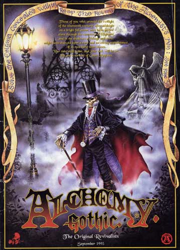
In 1995, finding that the overwhelming proportion of our customers were now in distinctly goth mood, we decided to recognise this in our branding and issued our first A4, full colour catalogue under the title ‘Alchemy Gothic’, and Count Magistus was born.
Count Magistus, announcing the arrival of the new 1995 ‘Alchemy Gothic’ brand and logo.
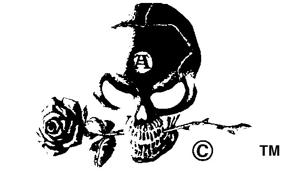
After its creation in 1987, (again, by artist/designer Trev Phillipson), the distinctive and now famous Alchemist’s Skull & Rose logo became Alchemy’s registered trade mark and began to appear on all literature, adverts, artwork and as a hallmark on all jewellery and giftware.
Following the popularity of the jewellery and its great significance to the company, Rieder Design was officially renamed Alchemy Carta in 1989, and its subsequent hallmarks and branding, especially with their inclusion in each annual catalogue, are well documented from this point.
The Alchemy Editorial Team
www.alchemyengland.com